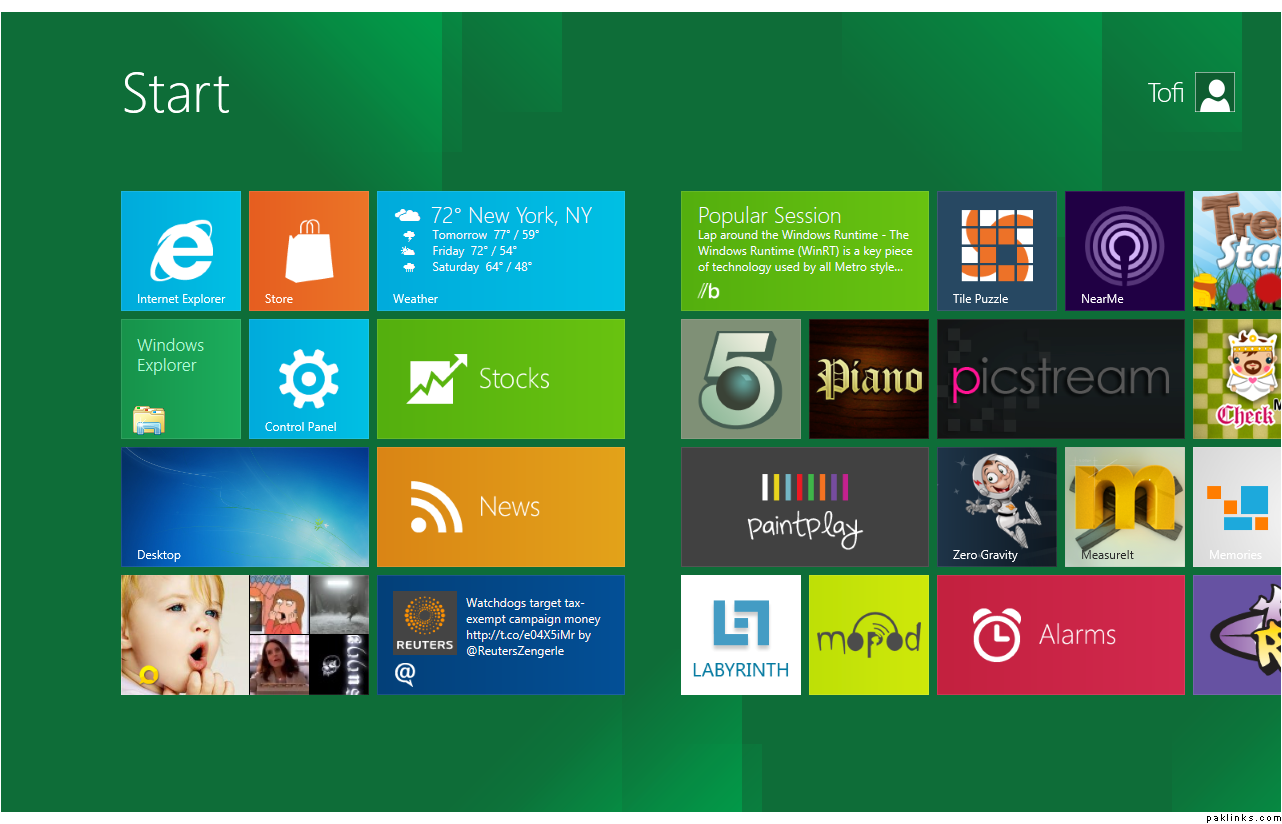
I finally got a copy working and got far enough in it (time constraints and problems with the installation) that I got to form any sort of opinions.
Overall it looks very alien
I initially attempted to install it as a Virtual Machine (VM) using an ESX and VMware workstation but nothing was working. I tried multiple downloaded (32 & 64 bit) copies. Finally I wiped my old laptop and installed it on there.
The new metro interface is nifty, but would take getting used to. All the various applications are setup in a tile format with real time updates, including FB, Twitter, weather etc. Check the screen-shot.
It still has a desktop portion which you can get to by pressing the Windows key. The desktop (Windows 7 style) is like a container unto itself. How do I explain this, its like you have the various application in Windows 8 and Desktop is one of those apps. So whatever you have running in the desktop side would be sandboxed and won’t effect other metro style applications.
I’m going to play around with it and keep posting other items in here. Please feel free to post questions, additions and comments here.
Technically in the enterprise users just stick to a few applications and then some real-time updates. As an example if i was working in the financial sector i’d have 2-3 monitors with some apps and then the tiles would keep giving me updates on things that are constantly changing. There are still some little UI issues that need to be mapped out. But for the most part M$ is trying to come up with an interface that would be common between desktops and tablets and phones but not going with desktop down, but mobile screen and up.
Touch would be a very prevalent way we’d be doing things, so everyone is gearing up to that point.
I just caught a Dev Preview of the Metro UI today. First impression: Great for touch interface but cumbersome for keyboard & mouse use.
Also, I couldn’t help but remember Microsoft’s numerous failed attempts at revamping the desktop:
Active Desktop with Win 98 / Win XP and IE , Windows Side Bar and Desktop Gadgets etc. and how ultimately, these features were rejected by end-users because it made for a more cluttered experience.
Also, from what I saw today, the Start Menu is gone and users now have to rely on program icons on their desktop screen, and this makes me wonder about the numerous other features that I use the Start Menu for and how they’ll be accomodated in the Metro framework.
That being said, I understand that this was just a Dev Preview and there may be significant improvements before the final version is launched.
There are still changes that are going to be made but as far as the UI goes, unless there is a significant noise by the dev community, this is a done deal. There might still be slight changes to tweak settings to make things smoother but for the majority of it this will stay.
The point they are trying to make is that what we were used to before is not the most efficient way of doing things. We, as humans, adapted to whatever it was that was available. For example the MS Office ribbon UI. If you have used previous versions of Office you’d have a steep curve learning the new interface as we’d be used to the familiar settings. But for someone who has never used Office things would be found in very intuitive locations. I’ve actually seen this happen at various client sites.
With Windows that’s the direction they seem to be going. The direction is “Minority Report” type interface. Gotta get the mouse and keyboard out.
and once that happens, we’d be all set with a UI like Metro, but I think we’re still far from seeing touchscreen interfaces becoming the norm with desktop / laptop computers.
Don’t get me wrong, I actually like the Metro UI… I’ve even installed Newgen on my Win 7 machine just to show my friends and family what the Win 8 experience will be like. I’m just trying to comprehend what changes this will bring to office computing and the implications for resources that need to be allocating for technology upgrades and end-user training.