i just created a poster, i know it has spelling errors i will correct them but i need to know what you think of the over all feel of the poster.
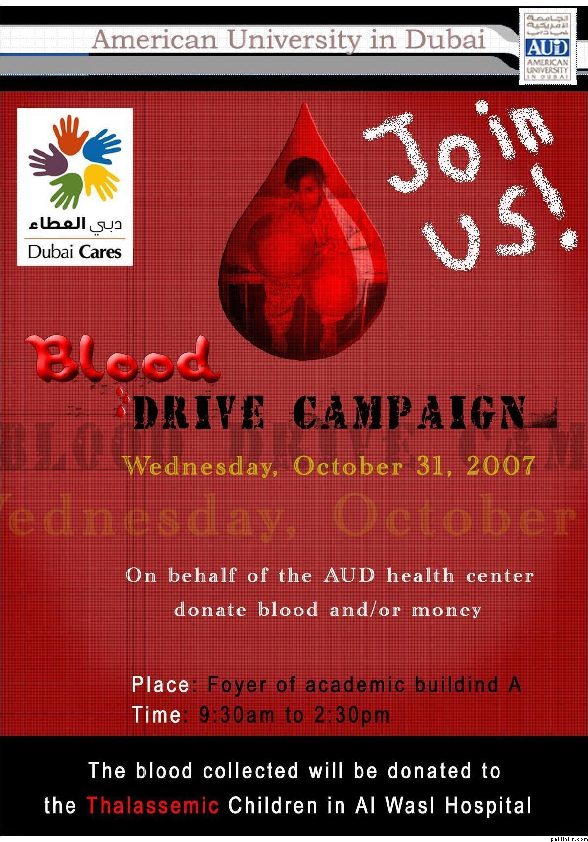
i just created a poster, i know it has spelling errors i will correct them but i need to know what you think of the over all feel of the poster.
Re: need ur opinions
Appreciated
Re: need ur opinions
Move Drive Campaign and everything under there (until Date/Place) little to the left. Make the size of font a little bigger and where it says On behalf of the..., move that a little up. Other than that, looks good.
Re: need ur opinions
thanks neemz for your valuable input anything other than that?
Re: need ur opinions
Nope, looks good. Just try to make the font size a little bigger so it can be seen from a little far.
Re: need ur opinions
ok thanks, this is important as this poster counts for 20% of my UNIV101 grade:bummer:
Re: need ur opinions
"join us" text appears too juvenile. Change the font and make it look appealing.
"blood drive campaign" should be in same font / texture cos thats the name of the event / purpose of this poster . currently "blood" is being read separately from "drive campaign" because of different font and texture. Remember your eyes read it first before it registers in your brain.
rest is all fine, seems like a good poster overall
Re: need ur opinions
thank you 5abi i have made the changes:)
btw this poster is done in photoshop:)
Re: need ur opinions
how about you lay it out like this:
" AUD health centre invites you to it's ...
BLOOD DRIVE CAMPAIGN
on
Wednesday , 31st October 2007
Your blood donations and contributions will be donated to the Thalassemic Children of Al Wasl Hospital
Share life- Give blood "
( In the black border at the bottom you can write the place and time of the campaign instead )
also you may want to omit the childs picture in the blood drop & rather in a sqaure box ( next to where it'll be written " Thalassemic children of Al wasl hospital...") you can have the same picture in colour or black n white...
Re: need ur opinions
Too much of a desktop feel to it and it's hardly catchy at first glance.
Re: need ur opinions
change the font of join us. (right now it gives amateur look to ur poster.)
suggestions
-instead of using rectangular shape, i would have make the poster in blood drop kinda shape.
- be precise and to the point.
-red is too much red.
-avoid shadowing.
Re: need ur opinions
I strongly suggest you revise the font choice. Reminds me of a vampire more then a blood drive. Maybe a more cheery font perhaps? I do like the layout of the poster. I don't like some of the gradient onthe font either...but thats a personal choice.
Re: need ur opinions
:k:…very well done
Re: need ur opinions
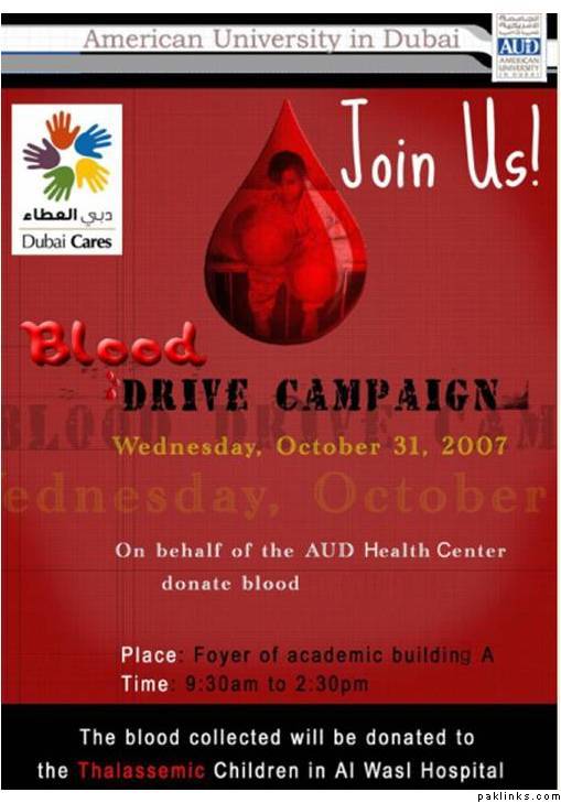
well people thanks but the poster has been finalised:)
will be posting the final version soon
Re: need ur opinions
typing error, it should be “Building” instead of buildind.
Re: need ur opinions
^ I think that’s how they say it in Dubai no? ![]()
J/k ![]()
Re: need ur opinions
yes i know its a mistake:rolleyes: thanks for pointing it out!
Re: need ur opinions
Peace Sister
Just a small note, do you think you need to give a section on it for:
e.g. Contact Details Call +35 6546 654 for more information
Re: need ur opinions
no not necessarily as the location is widely known
foyer of A building is quite popular
Re: need ur opinions
my posters, please evaluate