well genius ppl out here need ur help…i conducted a survey n nw hv to present the data in graphs…wat should i do? take no. of responses on y-axis and strongly agree—disagree(1 , 2 , 3 , 4 , 5) on x-axis…or wat?
plz help
well genius ppl out here need ur help…i conducted a survey n nw hv to present the data in graphs…wat should i do? take no. of responses on y-axis and strongly agree—disagree(1 , 2 , 3 , 4 , 5) on x-axis…or wat?
plz help
Re: imp n urgent
why not a pie chart?
if it is just one series
question about lets say if you think Paksan will win the championship.
if it is just one question, u can show teh spread of responses using a pie chart and just note total number of respondents with the chart
if u have more questions then pie chart will not work
Re: imp n urgent
Agree with X2, in your scenario, a pie chart seems very appropriate.
depends on what you want to present.
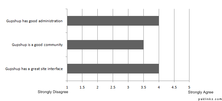
You say you have a 5 point likert-type scale… how many questions did you have in total? Do you need to do cross-comparisons of responses to these questions?
If so, then you can show the results on a horizontal bar chart with the scale labels on the x axis and the questions on the y axis, and each bar representing the average of each question.
Here’s an example:
On the other hand, if you want to show the percentage of responses for each scale label, then a pie-chart will be a better option.